
10 Amateur Art Mistakes to Avoid
- Zoe Papas
- Mar 22, 2024
- 4 min read

As a fine artist, student, drawing teacher, and art appreciator, I've learned many things about what makes a great piece of art. However, I’ve learned what makes work look amateur. The first step to mastery is being aware of what your weaknesses are and learning how you can improve. Here are some telltale things I've noticed that make an artwork look amateur and that should be avoided:
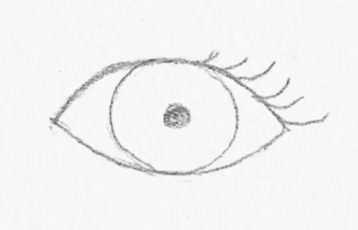
Using symbols
Drawing with symbols means relying on your preconceived notion of something instead of drawing it how you see it. Think of this as depicting an eye as a football shape with a couple circles in the middle instead of capturing the nuanced character of the eye on your subject. Another example is drawing a tree as cloud with a long rectangle as the base instead of depicting the crooked and winding nature of the tree in front of you.


Being out of proportion
Proportion can be really hard to learn, yet it is so important in your artwork. Being in proportion means things are the right size and in the right place. I often see students draw something really detailed that is in the wrong place and it can be heartbreaking to erase and redraw it. Therefore, I recommend starting with big basic shapes and avoiding details until the later stages of the process.


Features that don't line up
A proportion issue specific to subjects that are symmetrical, such as portraits (for the most part), is when features don’t quite line up. Most people can recognize this in the work of others, but they have a harder time seeing it in their own work. Having an eye that is too high on one side or a mouth at the wrong angle can ruin a likeness, so placing guidelines in your drawing can be very helpful.


Lack of compositional awareness
There is some overlap with the problems of proportion, but this refers to the whole picture. Even if your subject is accurate and well-rendered, the placement of that subject in relation to the picture plane can make or break your artwork. Think of drawing a figure and not leaving enough space for a limb so it gets cropped off. If the figure is intentionally cropped for the sake of the design, that is a different story. However, I often see this in beginning students who were unaware of how much space to leave to fit the figure on the page. My recommendation is to start with the outer limits of the subject and draw a simplified version of your subject (such as a gesture) which you can move around and ensure is in the right spot before moving forward.


Using only bright saturated colors
I see this often with paintings of a more decorative nature. Artists will often say that bright colors make them happy and refuse to use anything else. However, having dull colors next to bright colors makes the bright colors more impactful. Think of eating only icing instead of having just a bit on top of a cake. You need something to balance those bright colors.


Making grass too green
This had to be its own category because I see this so often in amateur landscape work. Grass will never be a permanent green straight out of the tube. It will often be a much more subtle green. Try mixing your green with some brown and yellow to achieve a more accurate grass color. You can even mix a warm green without green by using cadmium yellow and ivory black!


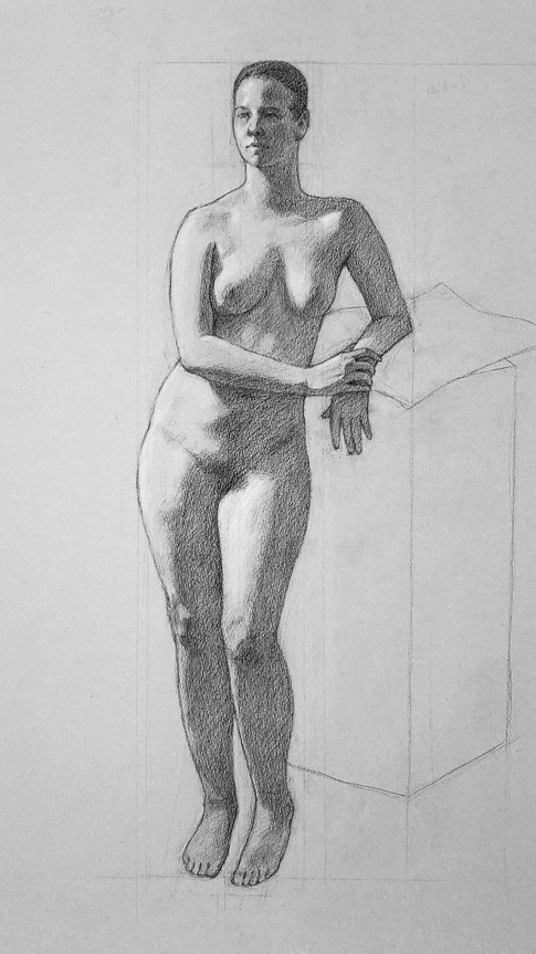
No midtones
Midtones are between the light and shadow areas. They are often hard to notice if you aren't looking for them. However, midtones are really important to creating a work of art that looks 3-dimensional. Of course, if you are going for a cartoon effect, you may choose to intentionally leave them out, but they definitely belong in a realistic artwork.


Lack of unified shadows
Having unified shadows is another thing that makes artwork look 3-dimensional. By this, I mean that the shadows shouldn't be overly detailed and should not contain any values that are reserved for the light and midtone areas. The reason to lose the complexity in the shadows is because when you draw and paint, you are forced to use relative value. You will never be able to paint as bright or as dark as you see in real life, so you have to adapt what you see to the smaller range of values you have to work with.


No light effect
What often separates good and great art can be the observation of the light effect. Think of a light source from above and how it would affect your subject. The light areas at the top of the subject would be brightest and they would gradually get darker the further they are from the light. If you draw a standing figure with a light from above and the arms and legs catching the light are the same tone, then the legs would have to be darkened to achieve the light effect. Having a dark background to frame the lights can help this effect.


Making all edges hard
I have seen this even with seasoned artists. It is something I am hyper aware of because I did it for a long time myself! In reality, you'll observe both hard and soft edges, and it makes for a much more interesting composition to include both. You can create a hierarchy of edges by choosing one hard edge to be the focal point and softening the edges around it. You can create atmosphere in a piece by softening edges that are farthest away, even if they appear as hard edges in reality.


Make sure to take this list with a grain of salt. Even master artists are aware that rules can be broken to better suit the artist's vision. Next time you break the rules, make sure to have a good reason!


Comments